ShopDreamUp AI ArtDreamUp
Deviation Actions
Hi everyone !
I've wanted to start making tutorials again for a while. However, writing a complete tutorial (and putting it together with a painting software ) demands me a lot of time... So I've decided to do something simpler by dividing my tutorial ideas into smaller parts and writing them as journals instead
The Basic Types of Folds
Almost two years ago, I've published a series of sketches on folds, which were the result of my current studies on the subject. I've recently started to study drapery and fabric again, so I've wanted to share my latest and up-to-date thoughts on this with you ^^
There will also be some general advice and tips on drawing.
Summary
I - The Diaper Folds
II - The Zigzag and Spiral Folds
I - The Diaper Folds
Here is the final drawing I will decompose in this tutorial :
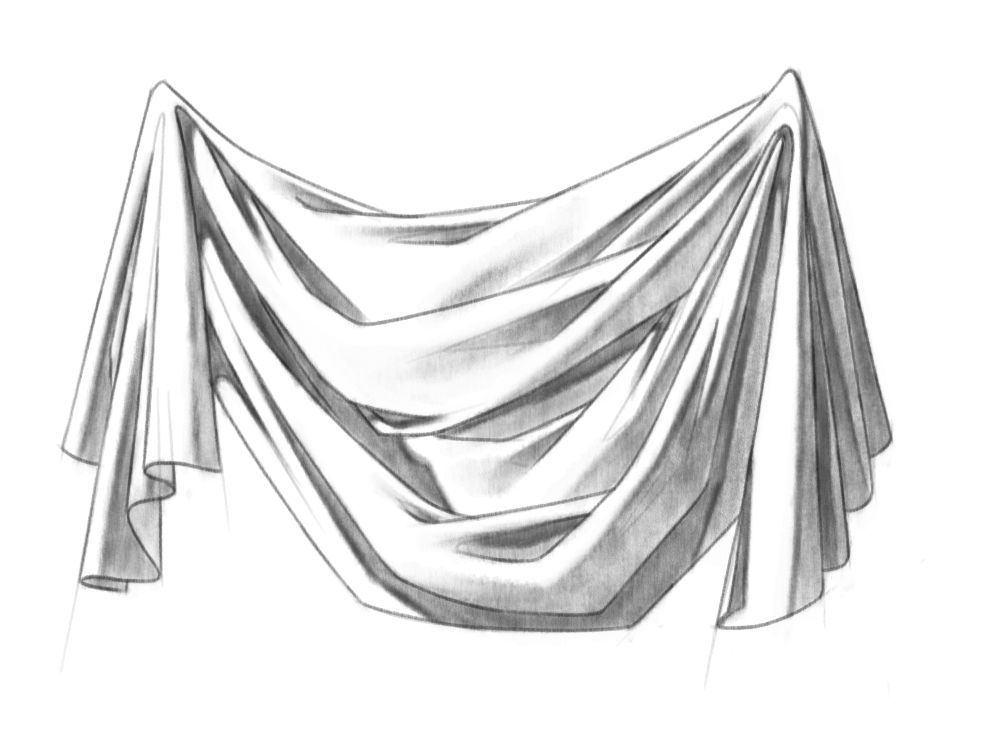
1. Definition
A diaper fold is created by the slacking of fabric between two points of tension. Schematically, this is what you should have in mind when you start sketching this kind of fold :

Notice that all main folds radiate from the tension points.
Some parts of the fabric are only connected to one of the points. Because of gravity, they fall straight to the ground and create pipe folds. I won't enter into details about those here, but they are pretty simple, so don't worry too much about them
The parts of the fabric which are connected to both tension points bend into diaper folds. The gravity pulls the fabric down, creating a concave upward curve between the two points.
2. General rules for sketching
Now this only gives you a general idea of the position and the direction of the folds. To go one step further, I'll give you some insight about what I think when I sketch folds. These tips are pretty generic, so most of them can in fact be applied to sketching any object.
For me, the aim of a sketch is to establish the structure and to start suggesting the volume of an object. Therefore, I want it to be simple, clear and confident, in order to create a sense of solidity. Here is the sketch I made for this drawing :
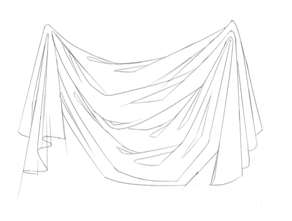
Rule 1 : Keep your strokes simples
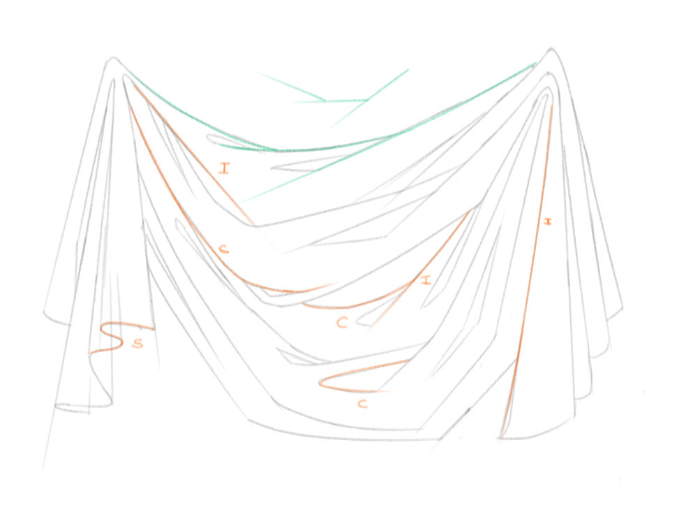
Ideally, you should mainly use straight lines ('I'), curved lines ('C') and exceptionally something as complex as a 'S' line when needed. Avoid unnecessary convoluted lines; make your strokes fluid, confident, and draw them in a single motion when possible.
Curved lines can be broken down into separate sections if appropriate, like the teal line in my example. But keep in mind that you want to simplify your subject, and avoid being caught by all the tiny bumps or creases there might be. Look for the main shapes.
Rule 2 : Keep your shapes varied

Try not to make all your shapes with the same width or the same length. Have short strokes, long strokes, large folds, narrow folds... Using too similar shapes can quickly give an artificial and amateurish look to your drawings. This is also true for clouds, trees, locks of hair...
But you actually don't need to make it excessively varied. Simply thinking of your shapes as either big, medium or small is usually enough to trick the eye into seeing a satisfying and natural amount of diversity
Rule 3 : Keep your lines meaningful
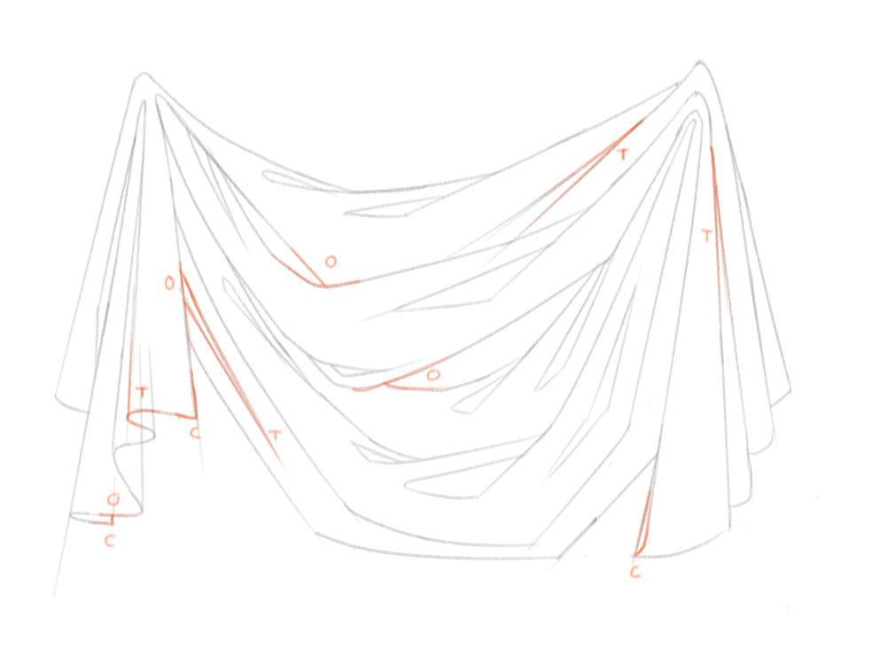
This is actually the principle that helped me the most for drawing folds. Constructions lines have a meaning and a purpose. They are here to define the contour and the various planes of an object. Therefore, floating lines starting or ending for no reason make no actual sense. It is ambiguous and it will confuse you when it'll come to shading your drawing.
A line can only end (or begin) in one of the following cases : if it is overlapped ('O') by another line, if it merges with another line at a tangent ('T') or if it meets another line at a corner ('C'). You shapes should be closed; an open shape does not make sense in terms of planes and volume.
Lines represent edges. Those edges can present different qualities, from hard to lost, and should ultimately be rendered as such. Usually when we ink a drawing, the softer edges are implied and only the harder edges are represented as lines, as shown here :

But in the earliest stages, I encourage you to mark all the edges as lines, regardless of their quality. It will force you to see those planes and to acknowledge the existence of soft edges and changes of orientation that you would otherwise maybe overlook.
Rule 4 : Keep the folds' directions
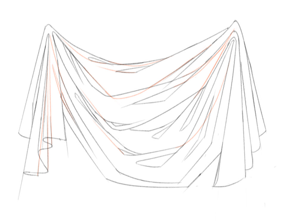
If you continue the lines which have been interrupted, they should follow the same principles as the visible lines. All the folds should converge toward the tension points, whether you can actually see them or not. Try to see through your drawing and to visualize your lines in their entirety. Do not hesitate to actually draw them if it helps you !
3. General Rules for shading
With a good preliminary sketch, shading (or painting in colors) should be easier. For me it is, and this is why I often spend a good amount of my time planning, drawing, constructing and such. Here are some additional tips to make the transition to values easier
Rule 1 : Think about the volume
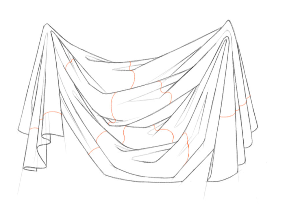
Take some time to analyze your drawing and to ask yourself if you can visualize the volumes of the various parts of your drawing. Remember that any complex shape can be regarded as made of basic shapes. In draperies, there rarely is any planar nor spherical surface, so everything can be considered a part of a cylinder or a cone. Don't hesitate to draw cross sections lines, like I did, if it helps you see better. See how the construction lines come in handy to suggest the volume.
Rule 2 : Think about the light source
Decide on the position of your light source and stick with it ! You don't have to be extremely accurate in your shadow placement as long as it seems roughly consistent. Here I imagined my light source would be at the top left of my drawing. Therefore core shadows will mainly be located on the bottom right of my shapes while cast shadows will likely appear on their top left.
Rule 3 : Think about the type of shadows
You may have felt lost when I mentioned 'core' and 'cast' shadows.
Basically, a core shadow is a shadow that is related to the form of an object. The planes perpendicular to the direction of the light receive the highest amount of light, and as the planes turn away from the light, they get gradually darker, until they don't receive any light. So that is why the parts oriented toward the light direction (top left) would be light, and the parts opposite (bottom right) would be in shadow.
Now an object can also get in shadow because something is preventing the light from reaching it. Each object projects its own shadow. Therefore, if a fold is located under another fold, the top fold will cast a shadow on the bottom fold, thus obscuring the top of the bottom fold (is that clear ? )
)

I have a few tips regarding how to render those types of shadows. First, make the cast shadows darker (we'll see why just the section after). Second, forget about the shape that is casting the shadow. It does affect the shape of the shadow, but it is way too complicated to be really taken into account when drawing from imagination. Instead, make the cast shadow follow the shape it is cast on. It will help better show the volume and the result will be accurate enough. Finally, cast shadows usually have harder edges than core shadows.
Rule 4 : Think about reflected lights
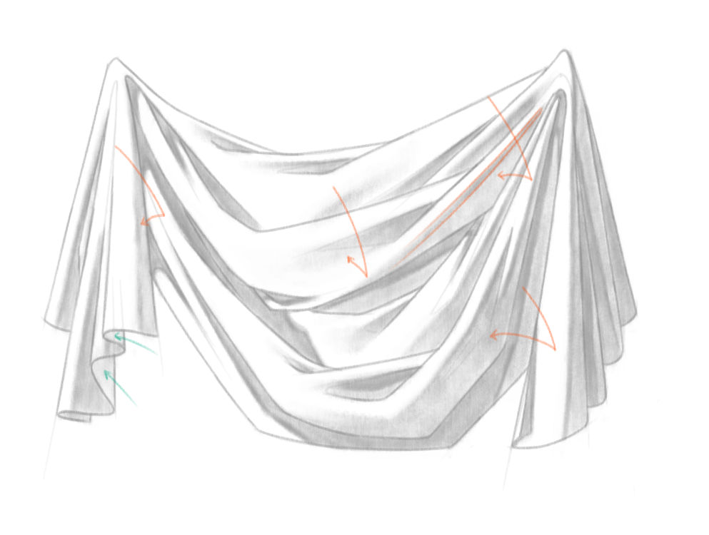
The darkest area of a core shadow is usually where it starts. It corresponds to the area that is tangent to the light direction and it is called the terminator. I've shown you one in orange. The rest of the core shadow is usually slightly lighter because of the light that bounces off lit surfaces (as shown by orange arrows). It can take many names : indirect lighting, reflected light, bounced light... All means the same actually. So try adding this slight gradation to your shadows and see how it looks !
Finally, some places I've indicated by teal arrows will be fairly light if the fabric is thin, because of the light passing through it
And that's it ! Damn, that was longer than I expected, I definitely don't know how to make something short. Hope you'll find something useful in that mess, and happy fold studies
I've wanted to start making tutorials again for a while. However, writing a complete tutorial (and putting it together with a painting software
The Basic Types of Folds
Almost two years ago, I've published a series of sketches on folds, which were the result of my current studies on the subject. I've recently started to study drapery and fabric again, so I've wanted to share my latest and up-to-date thoughts on this with you ^^
There will also be some general advice and tips on drawing.
Summary
I - The Diaper FoldsII - The Zigzag and Spiral Folds
I - The Diaper Folds
Here is the final drawing I will decompose in this tutorial :
1. Definition
A diaper fold is created by the slacking of fabric between two points of tension. Schematically, this is what you should have in mind when you start sketching this kind of fold :

Notice that all main folds radiate from the tension points.
Some parts of the fabric are only connected to one of the points. Because of gravity, they fall straight to the ground and create pipe folds. I won't enter into details about those here, but they are pretty simple, so don't worry too much about them
The parts of the fabric which are connected to both tension points bend into diaper folds. The gravity pulls the fabric down, creating a concave upward curve between the two points.
2. General rules for sketching
Now this only gives you a general idea of the position and the direction of the folds. To go one step further, I'll give you some insight about what I think when I sketch folds. These tips are pretty generic, so most of them can in fact be applied to sketching any object.
For me, the aim of a sketch is to establish the structure and to start suggesting the volume of an object. Therefore, I want it to be simple, clear and confident, in order to create a sense of solidity. Here is the sketch I made for this drawing :

Rule 1 : Keep your strokes simples

Ideally, you should mainly use straight lines ('I'), curved lines ('C') and exceptionally something as complex as a 'S' line when needed. Avoid unnecessary convoluted lines; make your strokes fluid, confident, and draw them in a single motion when possible.
Curved lines can be broken down into separate sections if appropriate, like the teal line in my example. But keep in mind that you want to simplify your subject, and avoid being caught by all the tiny bumps or creases there might be. Look for the main shapes.
Rule 2 : Keep your shapes varied

Try not to make all your shapes with the same width or the same length. Have short strokes, long strokes, large folds, narrow folds... Using too similar shapes can quickly give an artificial and amateurish look to your drawings. This is also true for clouds, trees, locks of hair...
But you actually don't need to make it excessively varied. Simply thinking of your shapes as either big, medium or small is usually enough to trick the eye into seeing a satisfying and natural amount of diversity
Rule 3 : Keep your lines meaningful

This is actually the principle that helped me the most for drawing folds. Constructions lines have a meaning and a purpose. They are here to define the contour and the various planes of an object. Therefore, floating lines starting or ending for no reason make no actual sense. It is ambiguous and it will confuse you when it'll come to shading your drawing.
A line can only end (or begin) in one of the following cases : if it is overlapped ('O') by another line, if it merges with another line at a tangent ('T') or if it meets another line at a corner ('C'). You shapes should be closed; an open shape does not make sense in terms of planes and volume.
Lines represent edges. Those edges can present different qualities, from hard to lost, and should ultimately be rendered as such. Usually when we ink a drawing, the softer edges are implied and only the harder edges are represented as lines, as shown here :

But in the earliest stages, I encourage you to mark all the edges as lines, regardless of their quality. It will force you to see those planes and to acknowledge the existence of soft edges and changes of orientation that you would otherwise maybe overlook.
Rule 4 : Keep the folds' directions

If you continue the lines which have been interrupted, they should follow the same principles as the visible lines. All the folds should converge toward the tension points, whether you can actually see them or not. Try to see through your drawing and to visualize your lines in their entirety. Do not hesitate to actually draw them if it helps you !
3. General Rules for shading
With a good preliminary sketch, shading (or painting in colors) should be easier. For me it is, and this is why I often spend a good amount of my time planning, drawing, constructing and such. Here are some additional tips to make the transition to values easier
Rule 1 : Think about the volume

Take some time to analyze your drawing and to ask yourself if you can visualize the volumes of the various parts of your drawing. Remember that any complex shape can be regarded as made of basic shapes. In draperies, there rarely is any planar nor spherical surface, so everything can be considered a part of a cylinder or a cone. Don't hesitate to draw cross sections lines, like I did, if it helps you see better. See how the construction lines come in handy to suggest the volume.
Rule 2 : Think about the light source
Decide on the position of your light source and stick with it ! You don't have to be extremely accurate in your shadow placement as long as it seems roughly consistent. Here I imagined my light source would be at the top left of my drawing. Therefore core shadows will mainly be located on the bottom right of my shapes while cast shadows will likely appear on their top left.
Rule 3 : Think about the type of shadows
You may have felt lost when I mentioned 'core' and 'cast' shadows.
Basically, a core shadow is a shadow that is related to the form of an object. The planes perpendicular to the direction of the light receive the highest amount of light, and as the planes turn away from the light, they get gradually darker, until they don't receive any light. So that is why the parts oriented toward the light direction (top left) would be light, and the parts opposite (bottom right) would be in shadow.
Now an object can also get in shadow because something is preventing the light from reaching it. Each object projects its own shadow. Therefore, if a fold is located under another fold, the top fold will cast a shadow on the bottom fold, thus obscuring the top of the bottom fold (is that clear ?

I have a few tips regarding how to render those types of shadows. First, make the cast shadows darker (we'll see why just the section after). Second, forget about the shape that is casting the shadow. It does affect the shape of the shadow, but it is way too complicated to be really taken into account when drawing from imagination. Instead, make the cast shadow follow the shape it is cast on. It will help better show the volume and the result will be accurate enough. Finally, cast shadows usually have harder edges than core shadows.
Rule 4 : Think about reflected lights

The darkest area of a core shadow is usually where it starts. It corresponds to the area that is tangent to the light direction and it is called the terminator. I've shown you one in orange. The rest of the core shadow is usually slightly lighter because of the light that bounces off lit surfaces (as shown by orange arrows). It can take many names : indirect lighting, reflected light, bounced light... All means the same actually. So try adding this slight gradation to your shadows and see how it looks !
Finally, some places I've indicated by teal arrows will be fairly light if the fabric is thin, because of the light passing through it
And that's it ! Damn, that was longer than I expected, I definitely don't know how to make something short. Hope you'll find something useful in that mess, and happy fold studies
The Making of 'Into the Woods' - III - Execution
Hi everyone !
As I can't really draw much these days, I propose you a series of journals detailing my process when painting "Into the Woods"
SummaryI - Composition
II - Preparation
III - Execution
III - Execution
1. Indoor referencing
At this stage, I will usually direct my efforts toward refining the focal point of the painting first. If that part works, then most of the job is done as the rest of the painting is pretty much just here to support that area :)
So I started by doing a photoshoot with my husband. Usually, I model for my female characters, but at this time, I was heavily pregnant so I had to avoid jumping, and my silhouet
The Making of 'Into the Woods' - II - Preparation
Hi everyone !
As I can't really draw much these days, I propose you a series of journals detailing my process when painting "Into the Woods"
Summary
I - Composition
II - Preparation
III - Execution
II - Preparation
1. Sketch
This was done mostly from imagination. I wasn't really concerned with the details and the realism at this point. My main goal was to refine the main shapes of my thumbnail. For instance, I tried to make sure that my rocks were of varying sizes, and that everything was flowing in a pleasant way. I also started to establish some very rough indications of light, as seen on the rocks. At this point, my layer stack look
The Making of 'Into the Woods' - I - Composition
Hi everyone !
As I can't really draw much these days, I propose you a series of journals detailing my process when painting "Into the Woods" :)
SummaryI - Composition
II - Preparation
III - Execution
I - Composition
To give you a bit of context, this image is a single-page illustration for a children's book I'm working on about the Arthurian Legends, entitled "Morgan le Fay". Morgan is actually the little girl featured on this painting, as this takes place at the very beginning of the story, when she was still living in Tintagel with both of her parents ^^
So, as a children's book illustration, there's going to be text added on the ima
Vegetable peelers are evil
I'm back \o/ And hem, I injured myself with a vegetable peeler and got a nasty cut on the eyebrow... @_@
If you're wondering how the hell does one hurt its eyebrow while peeling a carrot, I actually hurt my thumb and lifted my arm very quickly in reaction, thus hitting my face with my own hand, still holding the peeler. This is how...
I had to go to the hospital and I got a couple of stitches. It will maybe leave me a scar, just above my left eye.
So, sorry for the crappy sketch, that's just me telling myself that at least I'll join a couple of badass characters in the scarred left eye club x)
(Oh, and if you know about other character
© 2015 - 2024 Aliciane
Comments9
Join the community to add your comment. Already a deviant? Log In
Wonderfully detailed tutorial, and I think I might even prefer the "journal" format over the "jpg" format for tutorials. Thank you very much! 
